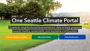
 Seattle has a new climate dashboard. You can filter for different map views of city data. For transportation emissions, you can select the year and click on the magnifying glass to type in an address to see an area. You can learn the breakdown of how a neighborhood uses transportation – walk, car, bike, bus…
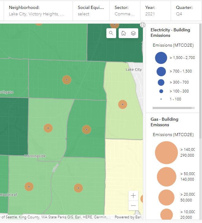
For building energy use emissions, you can also use the magnifying glass, or select a neighborhood. Pinehurst is lumped into two different views, but type Pinehurst to choose the one you want. In this sample map, you can see how there is much more building gas emission than electric.
Each map also provides a population breakdown by various criteria – race, education, health, etc.

Leave a Reply